Custom shape tappable area with CustomPaint widget on Flutter
I’ve seen some posts with things similar to this question, but they’re not what I’m looking for. I want to create a button with a custom shape in Flutter. For that I use a CustomPaint widget inside a GestureDetector widget. The problem is that I don’t want invisible areas to be tappable. And that's exactly what happens with the GestureDetector. In others words, I just want my created shape to be tappable. But right now it seems that there's an invisible square where my custom shape is, and that is also tappable. I don't want that. The most similar issue I found in this post:
Flutter - Custom button tap area
however, in my case I’m dealing with custom shapes and not with squares or circles.
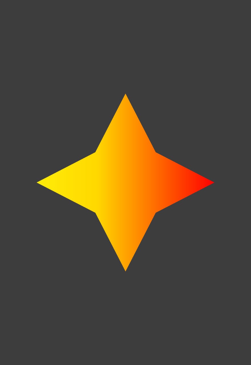
Let me share with you the code and an example image of a possible button. You could just copy it and paste it direct on your main. It should be easy to replicate my problem.
import 'package:flutter/material.dart';
import 'dart:ui' as ui;

void main() {
  runApp(MyApp());
}

class MyApp extends StatelessWidget {
  // This widget is the root of your application.
  @override
  Widget build(BuildContext context) {
    return MaterialApp(
      title: 'Custom Shapes',
      theme: ThemeData.dark(),
      home: MyHomePage(title: 'Custom Shapes App'),
    );
  }
}

class MyHomePage extends StatefulWidget {
  MyHomePage({Key key, this.title}) : super(key: key);

  final String title;

  @override
  _MyHomePageState createState() => _MyHomePageState();
}

class _MyHomePageState extends State<MyHomePage> {


  @override
  Widget build(BuildContext context) {
    return Scaffold(
      appBar: AppBar(
        title: Text(widget.title),
      ),
      backgroundColor: Colors.white24,
      body: Center(
        child: GestureDetector(
          child: CustomPaint(
            size: Size(300,300), //You can Replace this with your desired WIDTH and HEIGHT
            painter: RPSCustomPainter(),
          ),
          onTap: (){
            print("Working?");
          },
        ),
      ),
    );
  }
}
class RPSCustomPainter extends CustomPainter{

  @override
  void paint(Canvas canvas, Size size) {


    Paint paint_0 = new Paint()
      ..color = Color.fromARGB(255, 33, 150, 243)
      ..style = PaintingStyle.fill
      ..strokeWidth = 1;
    paint_0.shader = ui.Gradient.linear(Offset(0,size.height*0.50),Offset(size.width,size.height*0.50),[Color(0xffffed08),Color(0xffffd800),Color(0xffff0000)],[0.00,0.34,1.00]);

    Path path_0 = Path();
    path_0.moveTo(0,size.height*0.50);
    path_0.lineTo(size.width*0.33,size.height*0.33);
    path_0.lineTo(size.width*0.50,0);
    path_0.lineTo(size.width*0.67,size.height*0.33);
    path_0.lineTo(size.width,size.height*0.50);
    path_0.lineTo(size.width*0.67,size.height*0.67);
    path_0.lineTo(size.width*0.50,size.height);
    path_0.lineTo(size.width*0.33,size.height*0.67);
    path_0.lineTo(0,size.height*0.50);
    path_0.close();

    canvas.drawPath(path_0, paint_0);


  }

  @override
  bool shouldRepaint(covariant CustomPainter oldDelegate) {
    return true;
  }

}
I'd try that the star is the only tappable thing, and no other invisible place on the screen.
Thanks in advance!
 Iván Yoed
3 Answers
A GestureDetector is hit (and start detecting) when its child says it is hit (unless you chance its behavior property).
To specify when CustomPaint is hit, CustomPainter has a hitTest(Offset) method that you can override. It should return whether the Offset should be consider inside your shape. Unfortunately, the method doesn’t have a size parameter. (That’s a bug which solution has hit some inertia, see https://github.com/flutter/flutter/issues/28206)
The only good solution is to make a custom render object in which you override the paint and hitTestSelf methods (in the latter, you can use the objects size property).
For example:
class MyCirclePainter extends LeafRenderObjectWidget {
  const MyCirclePainter({@required this.radius, Key key}) : super(key: key);

  // radius relative to the widget's size
  final double radius;

  @override
  RenderObject createRenderObject(BuildContext context) => RenderMyCirclePainter()..radius = radius;

  @override
  void updateRenderObject(BuildContext context, RenderMyCirclePainter renderObject) => renderObject.radius = radius;
}

class RenderMyCirclePainter extends RenderBox {
  double radius;

  @override
  void performLayout() {
    size = constraints.biggest;
  }

  @override
  void performResize() {
    size = constraints.biggest;
  }

  @override
  void paint(PaintingContext context, Offset offset) {
    final center = size.center(offset);
    final r = 1.0 * radius * size.width;
    final backgroundPaint = Paint()
      ..color = const Color(0x88202020)
      ..style = PaintingStyle.fill;
    context.canvas.drawCircle(center, r, backgroundPaint);
  }

  @override
  bool hitTestSelf(Offset position) {
    final center = size.center(Offset.zero);
    return (position - center).distance < size.width * radius;
  }
}
Note that the top-left of the widget is at the offset parameter in the paint method, instead of the Offset.zero it is in CustomPainter.
You probably want to construct the path once and use path_0.contains(position) in hitTestSelf.
 spkersten
With help of this issue https://github.com/flutter/flutter/issues/60143 and the hint given that I should use a RaisedButton with a custom shape I was able solve the problem. I did some changes to the code posted on github. Mine wasn't the best to start with. There are other better options than using a CustomPaint widget with a GestureDetector.
Here you have the code. You should be able to see that if you tap anywhere outside the shape given, the print statement will not be triggered.
import 'package:flutter/material.dart';

void main() {
  runApp(App());
}

class App extends StatelessWidget {
  @override
  Widget build(BuildContext context) {
    return MaterialApp(
        home: Scaffold(body: Center(child: BuyTicketButton(100.0, ()=>{})))
    );
  }
}

class BuyTicketButton extends StatelessWidget {
  final double cost;
  final Function onTap;

  const BuyTicketButton(this.cost, this.onTap, {Key key}) : super(key: key);

  @override
  Widget build(BuildContext context) {
    return Center(
      child: Container(
        height: 400,
        child: RaisedButton(
          shape: CustomBorder(),
          onPressed: (){
            print("this works");
          },
        ),
      ),
    );
  }
}


class CustomBorder extends OutlinedBorder {

  const CustomBorder({
    BorderSide side = BorderSide.none
  }) : assert(side != null), super(side: side);

  Path customBorderPath(Rect rect) {
    Path path = Path();
    path.moveTo(0, 0);
    path.lineTo(rect.width, 0);
    path.lineTo(rect.width, rect.height);
    path.lineTo(0, rect.height);

    double diameter = rect.height / 3;
    double radius = diameter / 2;

    path.lineTo(0, diameter * 2);
    path.arcToPoint(
      Offset(0, diameter),
      radius: Radius.circular(radius),
      clockwise: false,
    );
    path.lineTo(0, 0);
    return path;
  }


  @override
  OutlinedBorder copyWith({BorderSide side}) {
    return CustomBorder(side: side ?? this.side);
  }

  @override
  EdgeInsetsGeometry get dimensions => EdgeInsets.all(side.width);

  @override
  Path getInnerPath(Rect rect, {TextDirection textDirection}) {
    return customBorderPath(rect);
  }

  @override
  Path getOuterPath(Rect rect, {TextDirection textDirection}) {
    return customBorderPath(rect);
  }

  @override
  void paint(Canvas canvas, Rect rect, {TextDirection textDirection}) {
    switch (side.style) {
      case BorderStyle.none:
        break;
      case BorderStyle.solid:
        canvas.drawPath(customBorderPath(rect), Paint()
          ..style = PaintingStyle.stroke
          ..color = Colors.black
          ..strokeWidth = 1.0
        );
    }
  }

  @override
  ShapeBorder scale(double t) => CustomBorder(side: side.scale(t));

}
This is the image you will be seeing. There, if you now tap on the half empty circle, you'll see nothing will happen. That's what I was expecting.

Nonetheless, I would recommend reading my other answer, which is for me so far better than this one.
There are for now two solutions so far, the first one is just by overriding hitTest of CustomPainter class, however the behavior is not the most desired. Because you don't have any splashcolor or similar when tapping. So here is the first one:
import 'package:flutter/material.dart';
import 'dart:ui' as ui;

void main() {
  runApp(App());
}

class App extends StatelessWidget {
  @override
  Widget build(BuildContext context) {
    return MaterialApp(
      home: Scaffold(
        backgroundColor: Colors.black54,
        body: Center(
          child: TappableStarButton(),
        ),
      ),
    );
  }
}

class TappableStarButton extends StatelessWidget {
  @override
  Widget build(BuildContext context) {
    return Center(
      child: GestureDetector(
        child: CustomPaint(
          size: Size(300, 300),
          painter: RPSCustomPainter(),
        ),
        onTap: () {
          print("This works");
        },
      ),
    );
  }
}

class RPSCustomPainter extends CustomPainter {
  Path path_0 = Path();

  @override
  void paint(Canvas canvas, Size size) {
    Paint paint_0 = new Paint()
      ..color = Color.fromARGB(255, 33, 150, 243)
      ..style = PaintingStyle.fill
      ..strokeWidth = 1;
    paint_0.shader = ui.Gradient.linear(
        Offset(10, 150),
        Offset(290, 150),
        [Color(0xffff1313), Color(0xffffbc00), Color(0xffffca00)],
        [0.00, 0.69, 1.00]);

    path_0.moveTo(150, 10);
    path_0.lineTo(100, 100);
    path_0.lineTo(10, 150);
    path_0.lineTo(100, 200);
    path_0.lineTo(150, 290);
    path_0.lineTo(200, 200);
    path_0.lineTo(290, 150);
    path_0.lineTo(200, 100);
    canvas.drawPath(path_0, paint_0);
  }

  @override
  bool hitTest(Offset position) {
    bool hit = path_0.contains(position);
    return hit;
  }

  @override
  bool shouldRepaint(covariant CustomPainter oldDelegate) {
    return true;
  }
}
And it works. The problem is that you don't see any behavior when you tap on the "button".
The other solution, and way better is by using Material with an Inkwell for your button. And for your shape, ShapeBorder class.
Here it is:
import 'package:flutter/material.dart';
import 'dart:ui' as ui;

void main() {
  runApp(App());
}

class App extends StatelessWidget {
  @override
  Widget build(BuildContext context) {
    return MaterialApp(
      home: Scaffold(
        backgroundColor: Colors.black38,
        body: StarButton(),
      ),
    );
  }
}

class StarButton extends StatelessWidget {

  @override
  Widget build(BuildContext context) {
    return Center(
      child: Container(
        height: 300,
        width: 300,
        child: Material(
          shape: StarShape(),
          color: Colors.orange,
          child: InkWell(
            splashColor: Colors.yellow,
            onTap: () => print('it works'),
          ),
        ),
      ),
    );
  }
}

class StarShape extends ShapeBorder {
  @override
  EdgeInsetsGeometry get dimensions => null;

  @override
  Path getInnerPath(Rect rect, {ui.TextDirection textDirection}) => null;

  @override
  void paint(Canvas canvas, Rect rect, {ui.TextDirection textDirection}) =>
      null;

  @override
  ShapeBorder scale(double t) => null;

  @override
  Path getOuterPath(Rect rect, {ui.TextDirection textDirection}) {
    return Path()
      ..moveTo(150, 10)
      ..lineTo(100, 100)
      ..lineTo(10, 150)
      ..lineTo(100, 200)
      ..lineTo(150, 290)
      ..lineTo(200, 200)
      ..lineTo(290, 150)
      ..lineTo(200, 100)
      ..close();
  }
}
User contributions licensed under CC BY-SA 3.0