How to switch a column header style with another dynamically when they're used indirectly, inherited using BasedOn in each column
I have a DataGrid. I wish to style it, allowing the user to select a theme from a set of themes (initially Light and Dark). With my knowledge I can do this only for a single theme.
I thought about using the DataGridColumnHeader style in Resources using it through DynamicResource and changing it in code-behind, but before any window shows up I get this error and then 2 similar errors:
System.Windows.Markup.XamlParseException
  HResult=0x80131501
  Message=A 'DynamicResourceExtension' cannot be set on the 'BasedOn' property of type 'Style'. A 'DynamicResourceExtension' can only be set on a DependencyProperty of a DependencyObject.
  Source=PresentationFramework
  StackTrace:
   at System.Windows.Markup.WpfXamlLoader.Load(XamlReader xamlReader, IXamlObjectWriterFactory writerFactory, Boolean skipJournaledProperties, Object rootObject, XamlObjectWriterSettings settings, Uri baseUri)
   at System.Windows.Markup.WpfXamlLoader.LoadBaml(XamlReader xamlReader, Boolean skipJournaledProperties, Object rootObject, XamlAccessLevel accessLevel, Uri baseUri)
   at System.Windows.Markup.XamlReader.LoadBaml(Stream stream, ParserContext parserContext, Object parent, Boolean closeStream)
   at System.Windows.Application.LoadComponent(Object component, Uri resourceLocator)
   at wpf_datagrid_themes_1.MainWindow.InitializeComponent() in G:\Lucru\teste\wpf-datagrid-themes-1\wpf-datagrid-themes-1\MainWindow.xaml:line 1
I also tried moving this style inside DataGrid.ColumnHeaderStyle but then I cannot inherit from it.
XAML
<Window x:Class="wpf_datagrid_themes_1.MainWindow"
        xmlns="http://schemas.microsoft.com/winfx/2006/xaml/presentation"
        xmlns:x="http://schemas.microsoft.com/winfx/2006/xaml"
        xmlns:d="http://schemas.microsoft.com/expression/blend/2008"
        xmlns:mc="http://schemas.openxmlformats.org/markup-compatibility/2006"
        xmlns:local="clr-namespace:wpf_datagrid_themes_1"
        mc:Ignorable="d"
        Title="MainWindow" Height="200" Width="450">
    <Grid Margin="20">
        <Grid.RowDefinitions>
            <RowDefinition/>
            <RowDefinition Height="Auto"/>
        </Grid.RowDefinitions>

        <DataGrid x:Name="MyDataGrid">
            <DataGrid.Resources>
                <Style TargetType="DataGridColumnHeader" x:Key="DataGridColumnHeaderDarkStyle">
                    <Setter Property="Background" Value="Black"/>
                    <Setter Property="TextElement.Foreground" Value="White"/>
                    <Setter Property="HorizontalContentAlignment" Value="Center"/>
                    <Setter Property="BorderThickness" Value="1"/>
                    <Setter Property="BorderBrush" Value="Gray"/>
                </Style>
            </DataGrid.Resources>

            <DataGrid.Columns>
                <DataGridTextColumn Header="Column 1" Width="*">
                    <DataGridTextColumn.HeaderStyle>
                        <Style TargetType="DataGridColumnHeader" BasedOn="{DynamicResource DataGridColumnHeaderDarkStyle}">
                            <Setter Property="ToolTip" Value="ToolTip for column 1"/>
                        </Style>
                    </DataGridTextColumn.HeaderStyle>
                </DataGridTextColumn>

                <DataGridTextColumn Header="Column 2" Width="*">
                    <DataGridTextColumn.HeaderStyle>
                        <Style TargetType="DataGridColumnHeader" BasedOn="{DynamicResource DataGridColumnHeaderDarkStyle}">
                            <Setter Property="ToolTip" Value="ToolTip for column 2"/>
                        </Style>
                    </DataGridTextColumn.HeaderStyle>
                </DataGridTextColumn>

                <DataGridTextColumn Header="Column 3" Width="*">
                    <DataGridTextColumn.HeaderStyle>
                        <Style TargetType="DataGridColumnHeader" BasedOn="{DynamicResource DataGridColumnHeaderDarkStyle}">
                            <Setter Property="ToolTip" Value="ToolTip for column 3"/>
                        </Style>
                    </DataGridTextColumn.HeaderStyle>
                </DataGridTextColumn>
            </DataGrid.Columns>
        </DataGrid>

        <Button Grid.Row="1" Click="Button_Click" Margin="10">
            CHANGE
        </Button>
    </Grid>
</Window>
Code-behind
using System.Windows;
using System.Windows.Controls.Primitives;

namespace wpf_datagrid_themes_1
{
    /// <summary>
    /// Interaction logic for MainWindow.xaml
    /// </summary>
    public partial class MainWindow : Window
    {
        public MainWindow()
        {
            InitializeComponent();
        }

        private void Button_Click(object sender, RoutedEventArgs e)
        {
            // Ideally, this handler should:
            //
            // if ( the dark style is applied ) : apply the light style
            // else : apply the dark style

            MyDataGrid.Resources["DataGridColumnHeaderDarkStyle"] =
                new Style(typeof(DataGridColumnHeader));
        }
    }
}
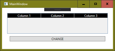
Screenshot when using StaticResource instead of DynamicResource
The code and markup presented above do not work well because using BasedOn with DynamicResource throws an error. I expected that it would work but I have to find a walkaround.
I use .NET Framework 4.7.2 with VS 2019 (latest stable version at the moment of this writing) and Windows 10 (latest stable version at the moment of this writing).
Thank you.
 silviubogan
1 Answer
You should change DynamicResource to StaticResource:
BasedOn="{StaticResource DataGridColumnHeader}">
...and then set the properties using DynamicResource:
<Style TargetType="DataGridColumnHeader" x:Key="DataGridColumnHeaderDarkStyle">
    <Setter Property="Background" Value="{DynamicResource Background}"/>
    <Setter Property="TextElement.Foreground" Value="{DynamicResource Foreground}"/>
    <Setter Property="HorizontalContentAlignment" Value="Center"/>
    <Setter Property="BorderThickness" Value="1"/>
    <Setter Property="BorderBrush" Value="Gray"/>
</Style>
You then define a Dark.xaml resource dictionary where you define the referenced Background and Foreground resources to be dark, and another Light.xaml resource dictionary where you define the resources to be light. You can then swith between these two resource dictionaries at runtime.
This is how you implement theming using resources, i.e. the you always use the same Style but the resources that this Style uses to set the properties of an element may change during runtime.
 mm8
mm8User contributions licensed under CC BY-SA 3.0